The Multiple Choice Block lets users pick from predefined text options. It is ideal for surveys, lead qualification, and branching logic.
General Settings
When you add a Multiple Choice block, the General tab opens by default.
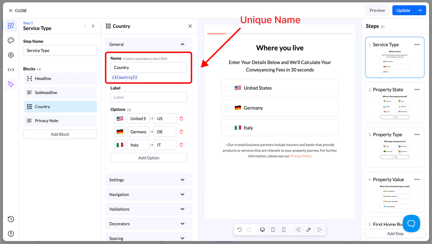
Name
- Unique field name used to store the answer in LanderLab
- Name you sent to your CRM
- Can be reused as a variable (e.g.,
{{financing}})
Label
- Optional text shown above the choices
- Used for extra context
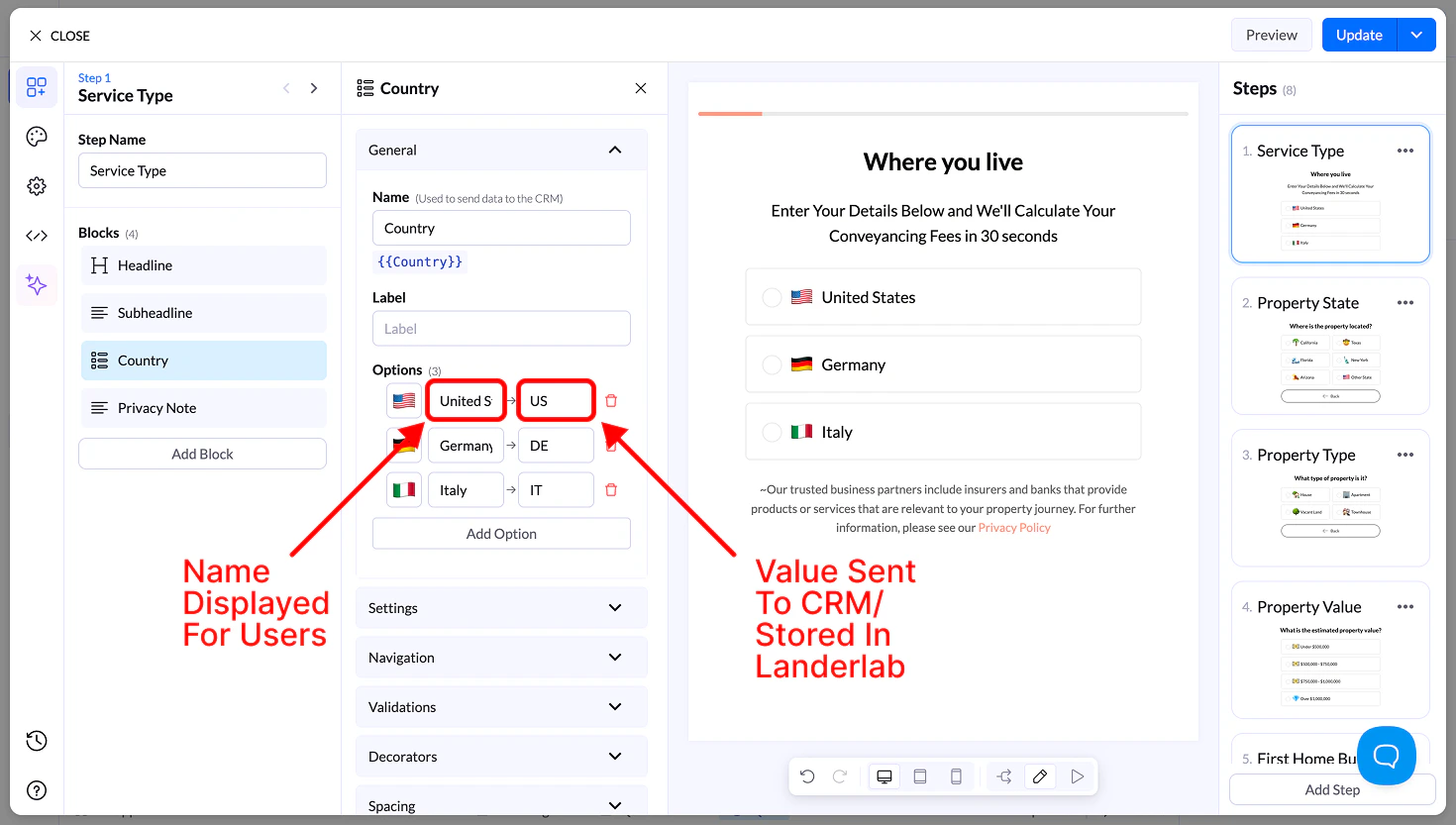
Options
Each option includes:
- Icon (optional) → Emoji or small icon
- Display Name → What the user sees
- Value → What is sent to your CRM
Example:
Display → United States of America
Value in CRM → USA
- Drag to reorder options
- Add or remove options freely
Settings
- Allow Multiple Selection → Users can select more than one option
- Requires a button to continue
- Sort Alphabetically → Orders options A–Z
- Reverse Order → Flips option order
- Randomize → Shuffles options on each load
Navigation & Validation
- Navigation → Control what happens after selection
- Validation → Require at least one selection before continuing
Decorators
- Multiple Selection Separator → Defines how values are stored (e.g.,
, ; /)
- Help Text → Small helper text below the block
Spacing
- Size → S, M, L, Full width
- Margin → Control spacing around the block
Appearance
- Layout Type → Grid or List
- Items per Row (Desktop & Mobile) → 1–6
- Align Options → Left, center, right
- Text Align → Alignment inside buttons
- Visibility → Show on Desktop, Mobile, or both
Design
You can customize styles using:
- Presets → Ready-made designs
- Advanced Settings:
- Base styles
- Default state
- Hover state
- Selected state