

General Settings
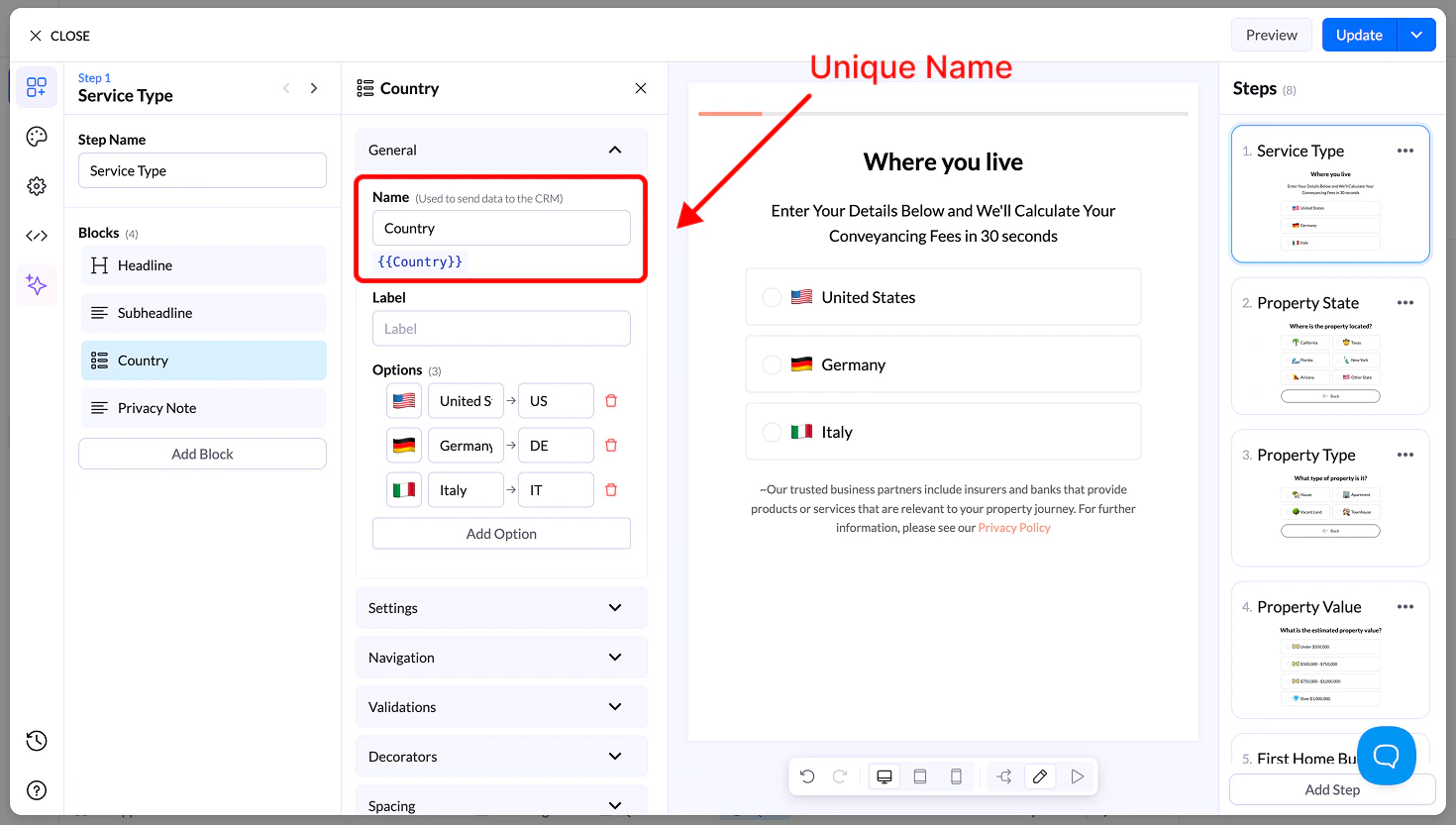
Name
- Unique field name used for storing and sending data
- Can be reused as a variable
Label
- Optional context text above the block
Options
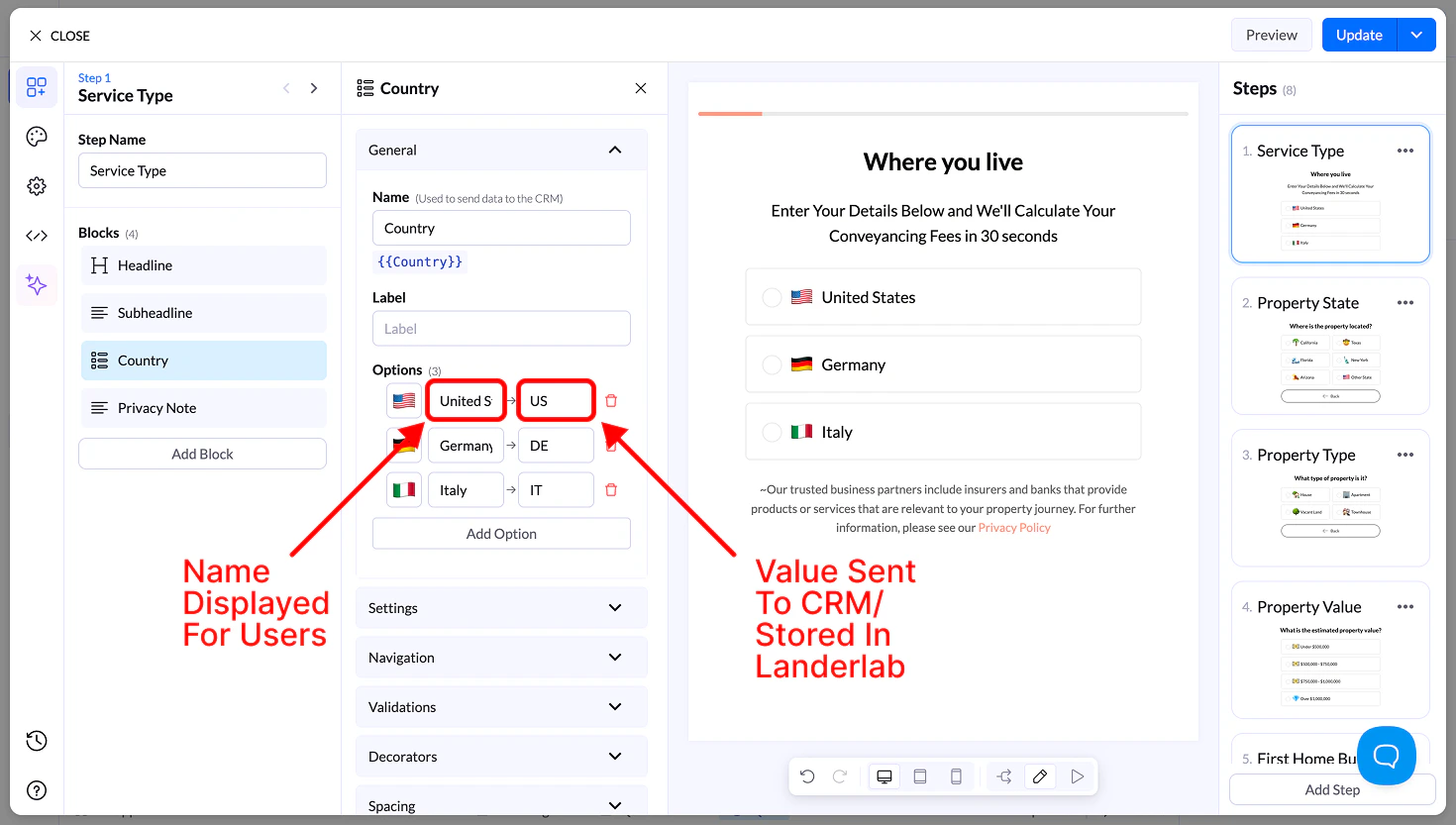
Each option includes:- Image → Upload or select an image
- Display Name → Visible label
- Value → Sent to your CRM
Settings
- Allow Multiple Selection → Select multiple images
- Requires button to continue
- Sort Alphabetically
- Reverse Order
- Randomize
Navigation & Validation
- Navigation → Define next steps or conditional flows
- Validation → Require at least one selection
Decorators
- Multiple Selection Separator → Define how values are stored
- Help Text → Add guidance below the block
Spacing
- Size → S, M, L, Full width
- Margin → Adjust spacing around the block
Appearance
- Layout Type → Grid or List
- Items per Row (Desktop & Mobile)
- Alignment options
- Visibility → Desktop / Mobile
Design
- Presets → Predefined styles
- Advanced Settings → Customize:
- Default state
- Hover state
- Selected state
- Borders, spacing, media size