LanderLab lets you design quizzes visually, but if you need more control, you can use Custom CSS to style your quiz beyond the built-in settings. This is useful when you want to fine-tune the appearance of quiz elements or apply styles that are not available in the editor.

How it works

LanderLab lets you inject custom CSS into your flow. Your CSS is automatically scoped inside the .ll-quiz root container, so styles only affect your quiz and never bleed into the rest of the page.

Where to add CSS

Css
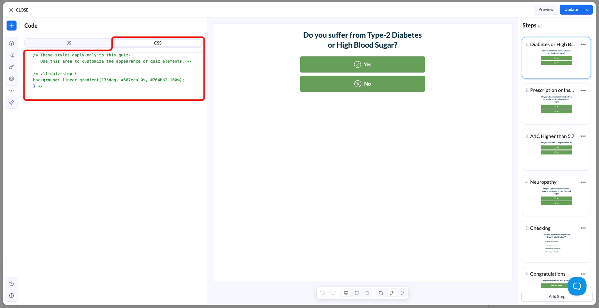
In your LanderLab editor, open Settings → Custom CSS and paste your rules there. Every selector you write is already inside .ll-quiz — you don’t need to prefix anything.
You cannot style the .ll-quiz root element itself (e.g. background, font-family). These are controlled by the theme engine. Target child elements instead.

Scoping rules

All your CSS lives inside .ll-quiz. Theme variables (like --colorPrimary) are read-only — they’re set by the theme engine and can’t be overridden. To change how something looks, write regular CSS rules targeting the selectors described in this guide. ✓ Do this
.ll-quiz-continue-button {
  background-color: #ff6600;
  color: #ffffff;
  border-radius: 50px;
}
✗ Not this - variables are read-only
/* This will NOT work */
.ll-quiz {
  --colorPrimary: #ff6600;
}

Selector reference

Use these selectors to target the elements you want to style. All of them are scoped inside .ll-quiz automatically.

Layout & structure

.ll-quiz-step All steps (visible + hidden) .ll-quiz-step[data-active-step=“true”] Only the currently visible step .ll-quiz-header Fixed top header area .ll-quiz-footer Fixed bottom footer area .ll-quiz-block Every block, any type .ll-quiz-block—[type] A specific block type (e.g. --text-field)

Inputs

.ll-quiz-block__input All text inputs and selects .ll-quiz-block__input-wrapper Wrapper div around inputs .ll-quiz-block__label Field labels .ll-quiz-block__decorator Prefix / suffix icons or text

Buttons

.ll-quiz-continue-button Continue button .ll-quiz-previous-button Previous / back button .ll-quiz-submit-button Submit button .ll-quiz-default-button Generic action button .ll-quiz-button-text Label inside any button .ll-quiz-button-description Sub-label inside any button

Choice blocks

.ll-choice-option A single multiple-choice option .ll-choice-option:has(input:checked) A selected option .ll-choice-option__text Text label inside an option .ll-img-choice-option An image choice option card .ll-img-choice-option:has(input:checked) Selected image choice card .ll-choice-label Choice block group label

Progress & feedback

.ll-quiz-progress__fill The filled bar portion .ll-quiz-header__progress-fill Header progress bar fill .ll-quiz-block—has-error A block that failed validation .ll-quiz-block-error The error message text .ll-quiz-variable Dynamic variables in text (e.g. first name)

Input fields

All text inputs, selects, textareas, and similar fields share the same class structure. Target .ll-quiz-block__input to style them all at once, or narrow by block type for individual control.

Style all input fields

CSS
.ll-quiz-block__input {
  background-color: #f9f9f9;
  border: 2px solid #e0e0e0;
  border-radius: 8px;
  font-size: 16px;
  padding: 12px 16px;
}

.ll-quiz-block__input:hover {
  border-color: #aaa;
}

.ll-quiz-block__input:focus {
  border-color: #3366ff;
  outline: none;
  box-shadow: 0 0 0 3px rgba(51, 102, 255, 0.12);
}

Target a specific block by ID

Find the block ID from the URL when editing a block in LanderLab (e.g. text-field-abc123).
#text-field-abc123 .ll-quiz-block__input {
  font-size: 20px;
  border-color: #ff6600;
}

Style prefix / suffix decorators

.ll-quiz-block__decorator--prefix {
  color: #888;
  font-size: 14px;
}

.ll-quiz-block__decorator--suffix svg {
  width: 18px;
  height: 18px;
  fill: #18c085;
}

Labels

.ll-quiz-block__label {
  font-size: 14px;
  font-weight: 600;
  margin-bottom: 6px;
  color: #333;
}

.ll-quiz-block__label-text {
  color: #555;
}

Buttons

Buttons in LanderLab render as <a> elements, not <button>. Use the specific selector for each button type, or target all buttons at once with a shared class.

Continue button

.ll-quiz-continue-button {
  background-color: #18c085;
  color: #ffffff;
  border-radius: 50px;
  padding: 14px 36px;
  font-size: 16px;
  font-weight: 600;
  transition: background-color 0.2s ease;
}

.ll-quiz-continue-button:hover {
  background-color: #14a872;
}

Previous button

.ll-quiz-previous-button {
  background: transparent;
  color: #888;
  border: 1.5px solid #ddd;
  border-radius: 8px;
}

.ll-quiz-previous-button:hover {
  border-color: #aaa;
  color: #555;
}

Submit button

.ll-quiz-submit-button {
  background-color: #ff6600;
  color: #fff;
  border-radius: 6px;
  font-weight: 700;
  letter-spacing: 0.03em;
}

.ll-quiz-submit-button:hover {
  background-color: #e05a00;
}

Style all buttons at once

.ll-quiz-continue-button,
.ll-quiz-submit-button,
.ll-quiz-default-button {
  border-radius: 12px;
  font-size: 15px;
  text-transform: uppercase;
  letter-spacing: 0.05em;
}

Button sub-label (description)

.ll-quiz-button-description {
  font-size: 12px;
  opacity: 0.75;
  font-weight: 400;
  display: block;
  margin-top: 2px;
}

Choice blocks

Multiple-choice and image-choice options can be styled in their default, hover, and selected states.

Style options

.ll-choice-option {
  border: 1.5px solid #e0e0e0;
  border-radius: 10px;
  padding: 12px 16px;
  background: #ffffff;
  transition: transform 0.15s ease, border-color 0.15s ease;
  cursor: pointer;
}

.ll-choice-option:hover {
  transform: scale(1.02);
  border-color: #18c085;
}

/* Selected state */
.ll-choice-option:has(input:checked) {
  background-color: #e6f9f3;
  border-color: #18c085;
}

Image choice cards

.ll-img-choice-option {
  border-radius: 12px;
  overflow: hidden;
  border: 2px solid transparent;
  transition: border-color 0.2s ease;
}

.ll-img-choice-option:has(input:checked) {
  border-color: #18c085;
  box-shadow: 0 0 0 3px rgba(24, 192, 133, 0.15);
}

Hide the radio / checkbox icon

.ll-choice-option__custom-input {
  display: none;
}

Progress bars

There are two progress bar locations — one inline in steps, and one in the header. Style them independently or together.

Inline progress bar

/* Track */
.ll-quiz-progress--bar {
  background-color: #e8e8e8;
  border-radius: 99px;
  height: 8px;
}

/* Fill */
.ll-quiz-progress__fill {
  background-color: #18c085;
  border-radius: 99px;
  transition: width 0.4s ease;
}

Header progress bar

.ll-quiz-header__progress {
  background-color: #f0f0f0;
  height: 4px;
}

.ll-quiz-header__progress-fill {
  background-color: #3366ff;
  transition: width 0.4s ease;
}

Responsive design

LanderLab uses CSS container queries, not media queries. Always use the container syntax below — standard @media queries won’t work as expected inside the quiz container. The breakpoint is 490px: anything wider is treated as desktop, anything narrower as mobile. Container query syntax
/* Desktop (wider than 490px) */
@container quiz-container (inline-size > 490px) {
  .ll-quiz-continue-button {
    font-size: 18px;
    padding: 16px 40px;
  }
}

/* Mobile (490px and below) */
@container quiz-container (inline-size <= 490px) {
  .ll-quiz-continue-button {
    width: 100%;
    font-size: 15px;
  }

  /* Hide a block on mobile */
  #my-block-id {
    display: none;
  }
}
Do not use @media queries Use @container quiz-container (...) instead of @media (...). The quiz is a container component and media queries won’t reflect its actual width.

States & validation

When a field fails validation, it receives the class .ll-quiz-block--has-error. Use this to style error states consistently with your design.

Error styling

/* Highlight the input wrapper */
.ll-quiz-block--has-error .ll-quiz-block__input-wrapper {
  border-color: #EA7A74;
  box-shadow: 0 0 0 3px rgba(234, 122, 116, 0.15);
}

/* Style the input itself */
.ll-quiz-block--has-error .ll-quiz-block__input {
  color: #c0392b;
}

/* Style the error message text */
.ll-quiz-block-error {
  font-size: 13px;
  color: #EA7A74;
  margin-top: 6px;
  font-weight: 500;
}

Dynamic text variables

Text blocks can include live variables like {{firstName}} that update as the user types. These render as .ll-quiz-variable spans.
.ll-quiz-variable {
  color: #18c085;
  font-weight: 600;
}

Full examples

Paste any of these into your Custom CSS panel to get started quickly.

Example 1 — Clean minimal theme

/* Inputs */
.ll-quiz-block__input {
  border: 1.5px solid #ddd;
  border-radius: 8px;
  background: #fafafa;
  font-size: 15px;
  padding: 11px 14px;
}
.ll-quiz-block__input:focus {
  border-color: #333;
  background: #fff;
  outline: none;
}

/* Continue button */
.ll-quiz-continue-button {
  background-color: #111;
  color: #fff;
  border-radius: 8px;
  font-weight: 600;
}
.ll-quiz-continue-button:hover {
  background-color: #333;
}

/* Choice options */
.ll-choice-option {
  border: 1.5px solid #eee;
  border-radius: 8px;
}
.ll-choice-option:has(input:checked) {
  border-color: #111;
  background: #f5f5f5;
}

Example 2 — Rounded colorful theme

/* Inputs */
.ll-quiz-block__input {
  border: 2px solid #e0e7ff;
  border-radius: 50px;
  padding: 12px 20px;
  font-size: 15px;
}
.ll-quiz-block__input:focus {
  border-color: #6366f1;
  outline: none;
}

/* Continue + submit buttons */
.ll-quiz-continue-button,
.ll-quiz-submit-button {
  background: linear-gradient(135deg, #6366f1, #8b5cf6);
  color: #fff;
  border-radius: 50px;
  font-weight: 700;
}

/* Progress */
.ll-quiz-progress__fill,
.ll-quiz-header__progress-fill {
  background-color: #6366f1;
  transition: width 0.5s cubic-bezier(0.4, 0, 0.2, 1);
}

/* Selected option */
.ll-choice-option:has(input:checked) {
  background-color: #eef2ff;
  border-color: #6366f1;
}

Example 3 — Mobile-first layout adjustments

@container quiz-container (inline-size <= 490px) {
  /* Full-width buttons on mobile */
  .ll-quiz-continue-button,
  .ll-quiz-submit-button {
    width: 100%;
    text-align: center;
    padding: 14px;
  }

  /* Larger tap targets for choices */
  .ll-choice-option {
    padding: 14px 16px;
    min-height: 52px;
  }

  /* Slightly larger input text */
  .ll-quiz-block__input {
    font-size: 16px; /* prevents iOS zoom on focus */
  }
}

Block type class list

Use these modifiers on .ll-quiz-block to target individual block types.
Modifier classBlock type
.ll-quiz-block--text-fieldText input
.ll-quiz-block--email-fieldEmail input
.ll-quiz-block--phone-number-fieldPhone input
.ll-quiz-block--number-fieldNumber input
.ll-quiz-block--textarea-fieldTextarea
.ll-quiz-block--select-fieldDropdown select
.ll-quiz-block--date-fieldDate picker
.ll-quiz-block--checkbox-fieldCheckbox
.ll-quiz-block--range-sliderRange slider
.ll-quiz-block--multiple-choiceMultiple choice
.ll-quiz-block--image-choiceImage choice
.ll-quiz-block--continueContinue button
.ll-quiz-block--submitSubmit button
.ll-quiz-block--headlineHeadline text
.ll-quiz-block--paragraphParagraph text
.ll-quiz-block--progressProgress bar
.ll-quiz-block--accordionAccordion
.ll-quiz-block--countdownCountdown timer