

Where to Find It
- Select a text element (headline, paragraph, button text, etc.)
- Go to the right panel
- Open the Typography section
Typography Settings
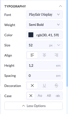
Font
- Choose the font family
Weight
- Controls how bold the text is
- Options range from light to bold
Color
- Sets the text color
- You can use color picker or RGB values
Size
- Controls text size
- Usually in pixels (px)
Align
- Align text:
- Left
- Center
- Right
Line Height
- Controls space between lines of text
- Helps improve readability
Letter Spacing
- Controls space between letters
- Useful for headings or stylistic text
Decoration
- Add text styles:
- Underline
- Strikethrough
- None
Case
- Controls text formatting:
- Uppercase
- Lowercase
- Capitalized
Important Note (Inheritance)
Typography settings follow a parent → child structure:- If you apply a font to a parent element (like a section or container)
- All child elements inside it will inherit that font automatically
Example
- Set font on a section → Inter
- All text inside uses Inter
👉 Only that block will be different
Best Practices
- Set fonts on parent containers for consistency
- Override only when needed
- Use larger sizes for headlines
- Keep body text readable
- Avoid too many font styles