Once a popup is created, the editor gives you full control. Add any content to the popup canvas and use the right sidebar to control when it appears, how it looks, and how it closes.
Click on a popup in the Popups panel to activate it on the canvas. The left sidebar switches to the Elements panel - the same one you use to build your landing page.
Drag and drop any element directly into the popup. Common use cases include:
- Headlines and text
- Images and video
- CTA buttons
- Forms and lead capture
- Quiz funnels
- Redirect links
- Countdown timers
- Custom code
You can use the AI builder inside the popup. Click the AI icon on the canvas to generate or rewrite content directly within the popup.
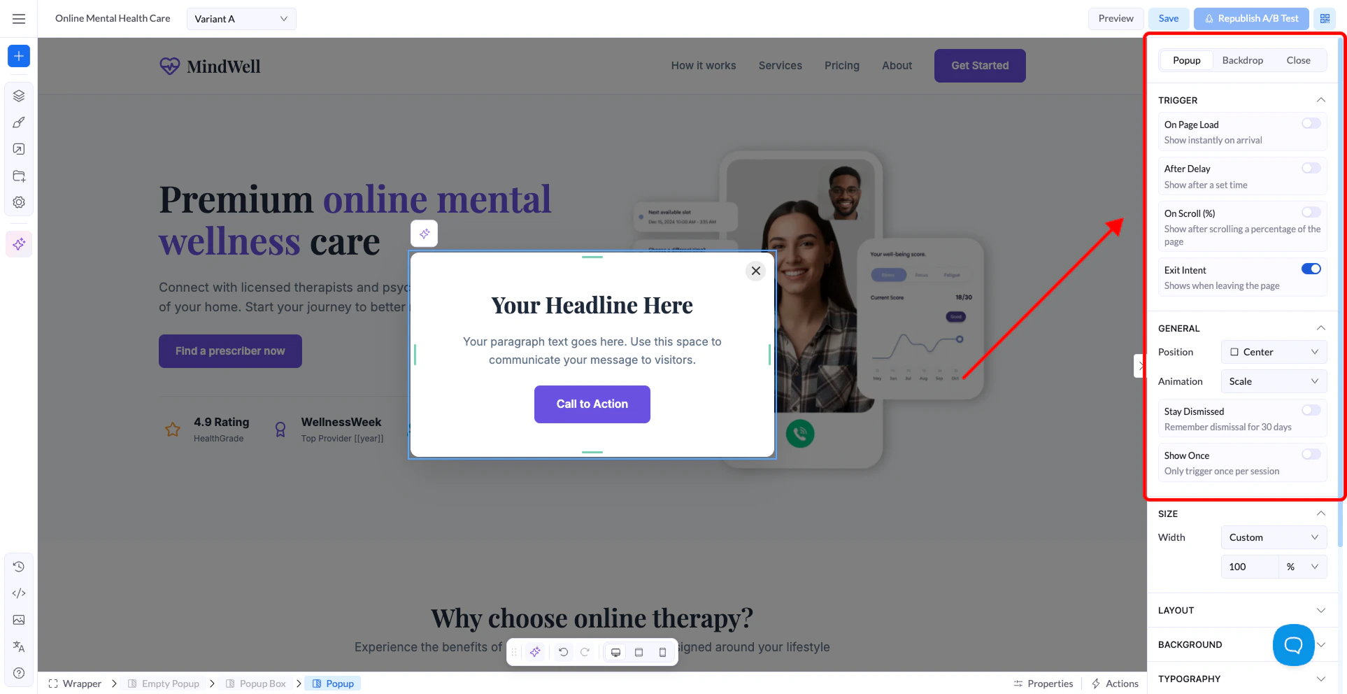
When a popup is selected, the right sidebar shows three tabs: Popup, Backdrop, and Close.
This is where you control when and how the popup appears.
Trigger - choose what causes the popup to show:
- On Page Load - shows immediately when the visitor arrives on the page.
- After Delay - shows after a set number of seconds. Enter the wait time in the field that appears.
- On Scroll (%) - shows after the visitor scrolls a percentage of the page. You can set different values for desktop, tablet, and mobile.
- Exit Intent - shows when the visitor is about to leave the page. General — controls position, animation, and display frequency:
- Position - where on screen the popup appears: Center, Top Left, Top Center, Top Right, Left Center, Right Center, or Bottom Left.
- Animation - how the popup enters: Scale, Fade, Slide Up, Slide Down, or Bounce.
- Stay Dismissed - when enabled, visitors who close the popup won’t see it again for 30 days.
- Show Once - only triggers the popup one time per session.
- Size, Layout, Background, Typography - standard styling options. Set the popup width, adjust spacing, background color, and font styles to match your page design.
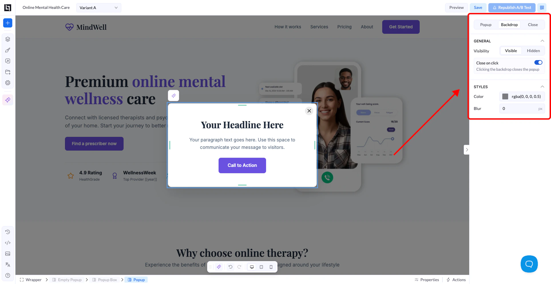
Backdrop tab
The backdrop is the darkened overlay that appears behind the popup. It helps focus the visitor’s attention on the popup content.
- Visibility - show or hide the backdrop entirely.
- Close on click - when enabled, clicking anywhere on the backdrop closes the popup.
- Color - set the backdrop color and opacity. Default is
rgba(0,0,0,0.5).
- Blur - apply a blur effect to the page content behind the popup.
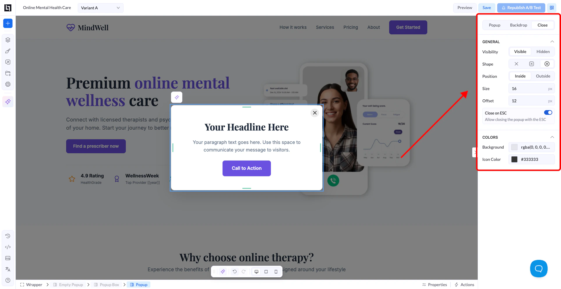
Close tab
Controls the close button displayed on the popup.
- Visibility - show or hide the close button.
- Shape - choose the icon style for the close button.
- Position - place the button inside or outside the popup box.
- Size and Offset - adjust the button size and its distance from the corner.
- Close on ESC - when enabled, pressing the Escape key also closes the popup.
- Colors - set the background and icon color of the close button.