

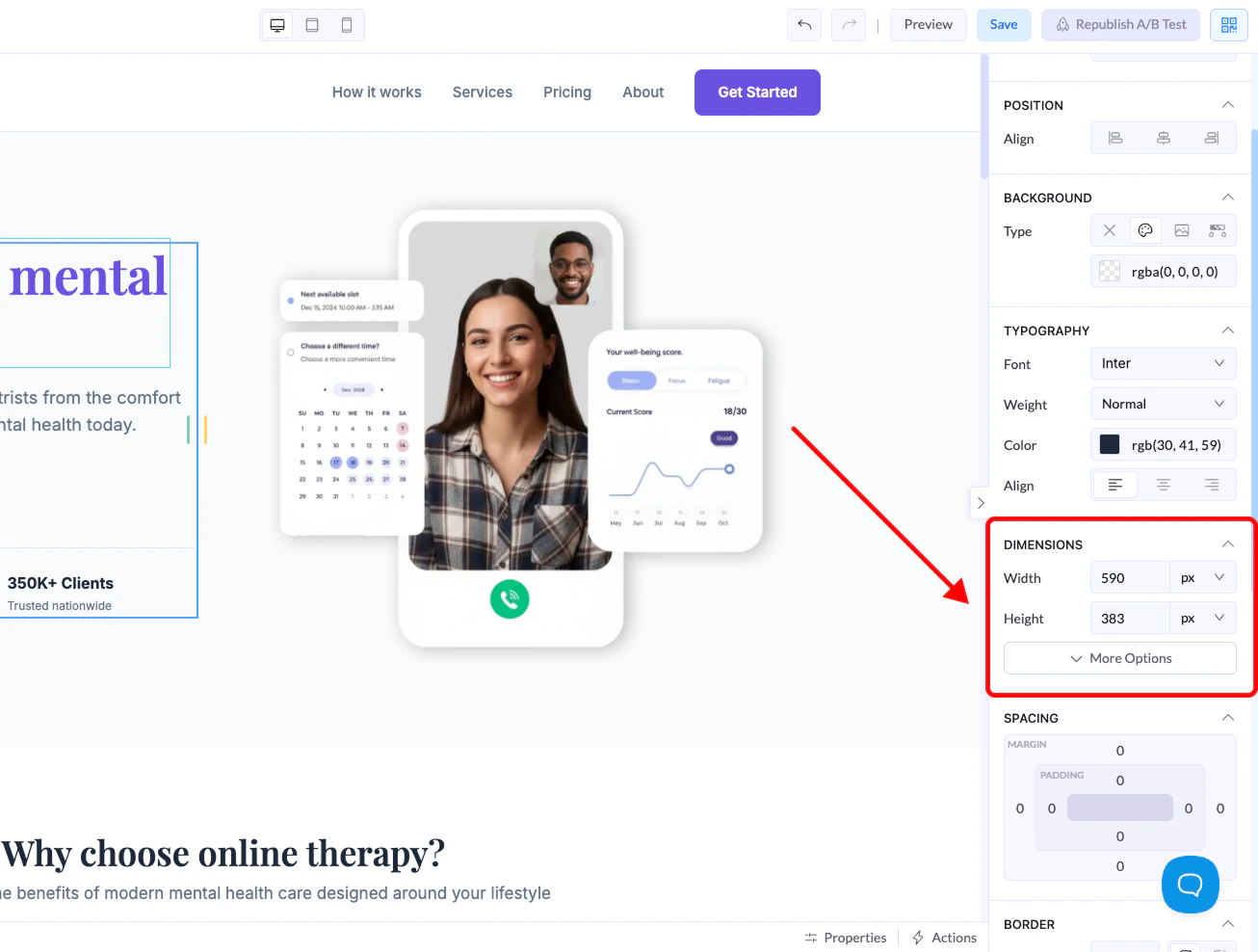
Where to Find It
- Click on any element in the canvas
- Go to the right panel
- Open the Dimensions section
Size Controls
Width
Controls how wide the element is.Height
Controls how tall the element is.Units Explained
When setting width or height, you can choose between different units: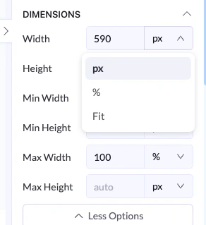
px (Pixels)
- Fixed size
- Does not change based on screen
- Best for precise control
% (Percentage)
- Relative to the parent container
- Responsive and flexible
- Best for layouts that adapt to screen size
Fit
- Automatically adjusts to content
- Element grows or shrinks based on what’s inside
Advanced Options
Click More Options to access: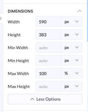
Min Width / Min Height
- Sets the smallest size the element can be
Max Width / Max Height
- Sets the largest size the element can grow to
Example
- Width →
100% - Max Width →
600px
Best Practices
- Use % for responsive layouts
- Use px for exact control
- Use Fit when content size should define the element
- Set max width to keep layouts clean on large screens