> ## Documentation Index
> Fetch the complete documentation index at: https://docs.landerlab.io/llms.txt
> Use this file to discover all available pages before exploring further.
# 设置元素尺寸:宽度、高度与最大宽度
> 在 Dimensions 设置中调整元素的宽度和高度,按需选择 px、% 或 Fit 单位,并设置最小和最大宽高,让布局在各种屏幕上保持整洁。
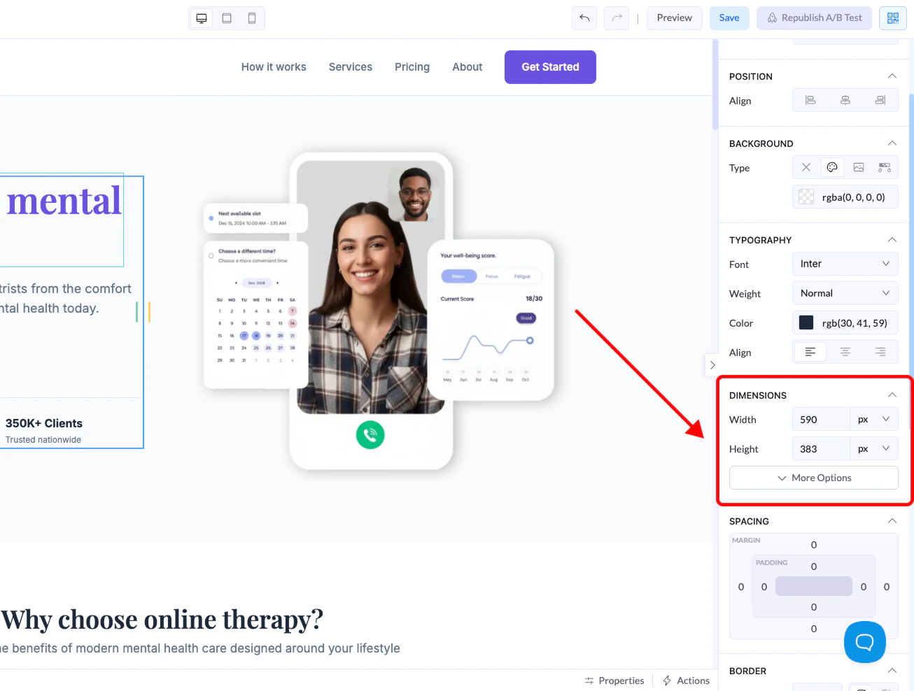
Dimensions 区域让你控制**画布上任何元素的尺寸**,用来管理布局、间距和响应式表现。
选中任意元素后,在**右侧面板**中就能找到这些设置。
## 在哪里找
1. 在画布上点击任意元素
2. 转到**右侧面板**
3. 展开 **Dimensions** 区域
 ## 尺寸控件
### Width
控制元素的宽度。
### Height
控制元素的高度。
## 单位说明
设置宽高时,可以选择不同单位:
## 尺寸控件
### Width
控制元素的宽度。
### Height
控制元素的高度。
## 单位说明
设置宽高时,可以选择不同单位:
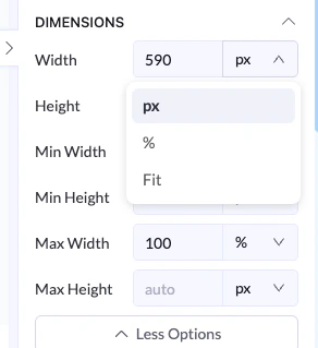 ### px(像素)
* 固定尺寸
* 不随屏幕变化
* 适合需要精确控制的场景
### %(百分比)
* 相对于父容器
* 响应式、灵活
* 适合需要适配屏幕尺寸的布局
### Fit
* 根据内容自动调整
* 元素随内部内容变大或变小
## 高级选项
点击 **More Options** 可以打开:
### px(像素)
* 固定尺寸
* 不随屏幕变化
* 适合需要精确控制的场景
### %(百分比)
* 相对于父容器
* 响应式、灵活
* 适合需要适配屏幕尺寸的布局
### Fit
* 根据内容自动调整
* 元素随内部内容变大或变小
## 高级选项
点击 **More Options** 可以打开:
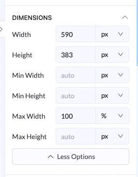 ### Min Width / Min Height
* 设置元素可以缩到的最小尺寸
### Max Width / Max Height
* 设置元素可以扩到的最大尺寸
## 示例
* Width 为 `100%`
* Max Width 为 `600px`
👉 元素在小屏幕上会拉伸,在大屏幕上则不超过 600px。
## 最佳实践
* 响应式布局用 **%**
* 需要精确控制时用 **px**
* 希望内容决定尺寸时用 **Fit**
* 设置 **max width**,让布局在大屏幕上也保持整洁
This documentation is built and hosted on [Mintlify](https://mintlify.com), a developer documentation platform.
### Min Width / Min Height
* 设置元素可以缩到的最小尺寸
### Max Width / Max Height
* 设置元素可以扩到的最大尺寸
## 示例
* Width 为 `100%`
* Max Width 为 `600px`
👉 元素在小屏幕上会拉伸,在大屏幕上则不超过 600px。
## 最佳实践
* 响应式布局用 **%**
* 需要精确控制时用 **px**
* 希望内容决定尺寸时用 **Fit**
* 设置 **max width**,让布局在大屏幕上也保持整洁
This documentation is built and hosted on [Mintlify](https://mintlify.com), a developer documentation platform.