> ## Documentation Index
> Fetch the complete documentation index at: https://docs.landerlab.io/llms.txt
> Use this file to discover all available pages before exploring further.

# Customize Your Page with Custom CSS

> Learn how to use Custom CSS in LanderLab quizzes to style quiz steps, inputs, dropdowns, and other elements beyond the built-in design settings.

LanderLab lets you design quizzes visually, but if you need more control, you can use **Custom CSS** to style your quiz beyond the built-in settings.

This is useful when you want to fine-tune the appearance of quiz elements or apply styles that are not available in the editor.

***

## How it works

LanderLab lets you inject custom CSS into your flow. Your CSS is automatically scoped inside the `.ll-quiz` root container, so styles only affect your quiz and never bleed into the rest of the page.

### Where to add CSS

<Frame>
  <img src="https://mintcdn.com/landerlab-babdc23f/nZqgRHMCi_31GFLg/images/css.png?fit=max&auto=format&n=nZqgRHMCi_31GFLg&q=85&s=8817775ebae44849d4a54a2b12073a74" alt="Css" width="1920" height="989" data-path="images/css.png" />
</Frame>

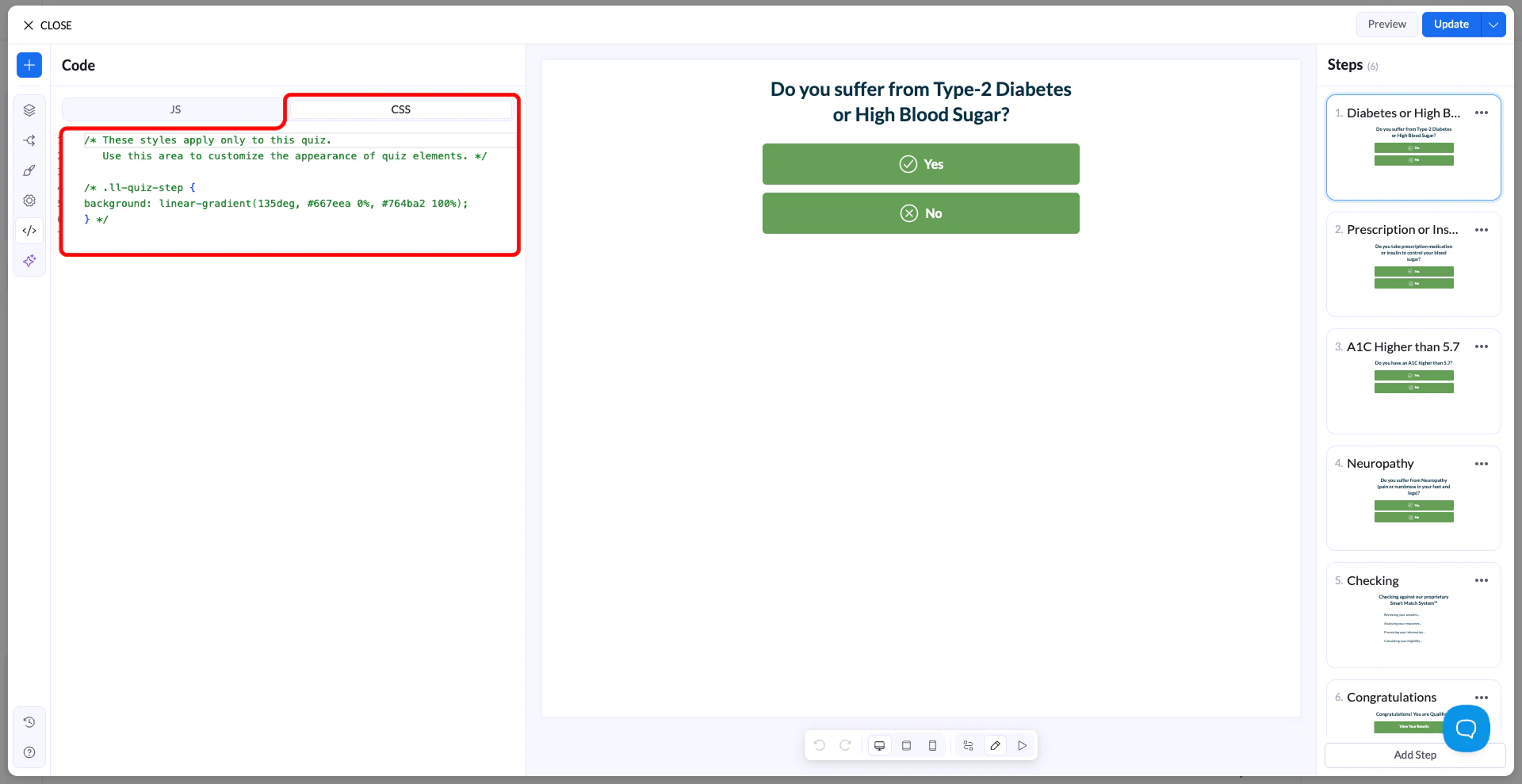
In your LanderLab editor, open **Settings → Custom CSS** and paste your rules there. Every selector you write is already inside `.ll-quiz` — you don't need to prefix anything.

<Tip>
  You cannot style the `.ll-quiz` root element itself (e.g. `background`, `font-family`). These are controlled by the theme engine. Target child elements instead.
</Tip>

## Scoping rules

All your CSS lives inside `.ll-quiz`. Theme variables (like `--colorPrimary`) are read-only — they're set by the theme engine and can't be overridden. To change how something looks, write regular CSS rules targeting the selectors described in this guide.

**✓ Do this**

```text theme={null}
.ll-quiz-continue-button {
  background-color: #ff6600;
  color: #ffffff;
  border-radius: 50px;
}
```

**✗ Not this - variables are read-only**

```text theme={null}
/* This will NOT work */
.ll-quiz {
  --colorPrimary: #ff6600;
}
```

## Selector reference

Use these selectors to target the elements you want to style. All of them are scoped inside `.ll-quiz` automatically.

### Layout & structure

**.ll-quiz-step**

All steps (visible + hidden)

**.ll-quiz-step\[data-active-step="true"]**

Only the currently visible step

**.ll-quiz-header**

Fixed top header area

**.ll-quiz-footer**

Fixed bottom footer area

**.ll-quiz-block**

Every block, any type

**.ll-quiz-block--\[type]**

A specific block type (e.g. `--text-field`)

### **Inputs**

**.ll-quiz-block\_\_input**

All text inputs and selects

**.ll-quiz-block\_\_input-wrapper**

Wrapper div around inputs

**.ll-quiz-block\_\_label**

Field labels

**.ll-quiz-block\_\_decorator**

Prefix / suffix icons or text

### **Buttons**

**.ll-quiz-continue-button**

Continue button

**.ll-quiz-previous-button**

Previous / back button

**.ll-quiz-submit-button**

Submit button

**.ll-quiz-default-button**

Generic action button

**.ll-quiz-button-text**

Label inside any button

**.ll-quiz-button-description**

Sub-label inside any button

### **Choice blocks**

**.ll-choice-option**

A single multiple-choice option

**.ll-choice-option:has(input:checked)**

A selected option

**.ll-choice-option\_\_text**

Text label inside an option

**.ll-img-choice-option**

An image choice option card

**.ll-img-choice-option:has(input:checked)**

Selected image choice card

**.ll-choice-label**

Choice block group label

### **Progress & feedback**

**.ll-quiz-progress\_\_fill**

The filled bar portion

**.ll-quiz-header\_\_progress-fill**

Header progress bar fill

**.ll-quiz-block--has-error**

A block that failed validation

**.ll-quiz-block-error**

The error message text

**.ll-quiz-variable**

Dynamic variables in text (e.g. first name)

## Input fields

All text inputs, selects, textareas, and similar fields share the same class structure. Target `.ll-quiz-block__input` to style them all at once, or narrow by block type for individual control.

### **Style all input fields**

**CSS**

```text theme={null}
.ll-quiz-block__input {
  background-color: #f9f9f9;
  border: 2px solid #e0e0e0;
  border-radius: 8px;
  font-size: 16px;
  padding: 12px 16px;
}

.ll-quiz-block__input:hover {
  border-color: #aaa;
}

.ll-quiz-block__input:focus {
  border-color: #3366ff;
  outline: none;
  box-shadow: 0 0 0 3px rgba(51, 102, 255, 0.12);
}
```

### Target a specific block by ID

Find the block ID from the URL when editing a block in LanderLab (e.g. `text-field-abc123`).

```text theme={null}
#text-field-abc123 .ll-quiz-block__input {
  font-size: 20px;
  border-color: #ff6600;
}
```

### Style prefix / suffix decorators

```text theme={null}
.ll-quiz-block__decorator--prefix {
  color: #888;
  font-size: 14px;
}

.ll-quiz-block__decorator--suffix svg {
  width: 18px;
  height: 18px;
  fill: #18c085;
}
```

### Labels

```text theme={null}
.ll-quiz-block__label {
  font-size: 14px;
  font-weight: 600;
  margin-bottom: 6px;
  color: #333;
}

.ll-quiz-block__label-text {
  color: #555;
}
```

## Buttons

Buttons in LanderLab render as `<a>` elements, not `<button>`. Use the specific selector for each button type, or target all buttons at once with a shared class.

### Continue button

```text theme={null}
.ll-quiz-continue-button {
  background-color: #18c085;
  color: #ffffff;
  border-radius: 50px;
  padding: 14px 36px;
  font-size: 16px;
  font-weight: 600;
  transition: background-color 0.2s ease;
}

.ll-quiz-continue-button:hover {
  background-color: #14a872;
}
```

### Previous button

```text theme={null}
.ll-quiz-previous-button {
  background: transparent;
  color: #888;
  border: 1.5px solid #ddd;
  border-radius: 8px;
}

.ll-quiz-previous-button:hover {
  border-color: #aaa;
  color: #555;
}
```

### Submit button

```text theme={null}
.ll-quiz-submit-button {
  background-color: #ff6600;
  color: #fff;
  border-radius: 6px;
  font-weight: 700;
  letter-spacing: 0.03em;
}

.ll-quiz-submit-button:hover {
  background-color: #e05a00;
}
```

### Style all buttons at once

```text theme={null}
.ll-quiz-continue-button,
.ll-quiz-submit-button,
.ll-quiz-default-button {
  border-radius: 12px;
  font-size: 15px;
  text-transform: uppercase;
  letter-spacing: 0.05em;
}
```

### Button sub-label (description)

```text theme={null}
.ll-quiz-button-description {
  font-size: 12px;
  opacity: 0.75;
  font-weight: 400;
  display: block;
  margin-top: 2px;
}
```

## Choice blocks

Multiple-choice and image-choice options can be styled in their default, hover, and selected states.

### Style options

```text theme={null}
.ll-choice-option {
  border: 1.5px solid #e0e0e0;
  border-radius: 10px;
  padding: 12px 16px;
  background: #ffffff;
  transition: transform 0.15s ease, border-color 0.15s ease;
  cursor: pointer;
}

.ll-choice-option:hover {
  transform: scale(1.02);
  border-color: #18c085;
}

/* Selected state */
.ll-choice-option:has(input:checked) {
  background-color: #e6f9f3;
  border-color: #18c085;
}
```

### Image choice cards

```text theme={null}
.ll-img-choice-option {
  border-radius: 12px;
  overflow: hidden;
  border: 2px solid transparent;
  transition: border-color 0.2s ease;
}

.ll-img-choice-option:has(input:checked) {
  border-color: #18c085;
  box-shadow: 0 0 0 3px rgba(24, 192, 133, 0.15);
}
```

### Hide the radio / checkbox icon

```text theme={null}
.ll-choice-option__custom-input {
  display: none;
}
```

## Progress bars

There are two progress bar locations — one inline in steps, and one in the header. Style them independently or together.

### Inline progress bar

```text theme={null}
/* Track */
.ll-quiz-progress--bar {
  background-color: #e8e8e8;
  border-radius: 99px;
  height: 8px;
}

/* Fill */
.ll-quiz-progress__fill {
  background-color: #18c085;
  border-radius: 99px;
  transition: width 0.4s ease;
}
```

### Header progress bar

```text theme={null}
.ll-quiz-header__progress {
  background-color: #f0f0f0;
  height: 4px;
}

.ll-quiz-header__progress-fill {
  background-color: #3366ff;
  transition: width 0.4s ease;
}
```

## Responsive design

LanderLab uses **CSS container queries**, not media queries. Always use the container syntax below — standard `@media` queries won't work as expected inside the quiz container.

The breakpoint is **490px**: anything wider is treated as desktop, anything narrower as mobile.

**Container query syntax**

```text theme={null}
/* Desktop (wider than 490px) */
@container quiz-container (inline-size > 490px) {
  .ll-quiz-continue-button {
    font-size: 18px;
    padding: 16px 40px;
  }
}

/* Mobile (490px and below) */
@container quiz-container (inline-size <= 490px) {
  .ll-quiz-continue-button {
    width: 100%;
    font-size: 15px;
  }

  /* Hide a block on mobile */
  #my-block-id {
    display: none;
  }
}
```

**Do not use @media queries**

Use `@container quiz-container (...)` instead of `@media (...)`. The quiz is a container component and media queries won't reflect its actual width.

## States & validation

When a field fails validation, it receives the class `.ll-quiz-block--has-error`. Use this to style error states consistently with your design.

### Error styling

```text theme={null}
/* Highlight the input wrapper */
.ll-quiz-block--has-error .ll-quiz-block__input-wrapper {
  border-color: #EA7A74;
  box-shadow: 0 0 0 3px rgba(234, 122, 116, 0.15);
}

/* Style the input itself */
.ll-quiz-block--has-error .ll-quiz-block__input {
  color: #c0392b;
}

/* Style the error message text */
.ll-quiz-block-error {
  font-size: 13px;
  color: #EA7A74;
  margin-top: 6px;
  font-weight: 500;
}
```

### Dynamic text variables

Text blocks can include live variables like `{{firstName}}` that update as the user types. These render as `.ll-quiz-variable` spans.

```text theme={null}
.ll-quiz-variable {
  color: #18c085;
  font-weight: 600;
}
```

## Full examples

Paste any of these into your Custom CSS panel to get started quickly.

### Example 1 — Clean minimal theme

```text theme={null}
/* Inputs */
.ll-quiz-block__input {
  border: 1.5px solid #ddd;
  border-radius: 8px;
  background: #fafafa;
  font-size: 15px;
  padding: 11px 14px;
}
.ll-quiz-block__input:focus {
  border-color: #333;
  background: #fff;
  outline: none;
}

/* Continue button */
.ll-quiz-continue-button {
  background-color: #111;
  color: #fff;
  border-radius: 8px;
  font-weight: 600;
}
.ll-quiz-continue-button:hover {
  background-color: #333;
}

/* Choice options */
.ll-choice-option {
  border: 1.5px solid #eee;
  border-radius: 8px;
}
.ll-choice-option:has(input:checked) {
  border-color: #111;
  background: #f5f5f5;
}
```

### Example 2 — Rounded colorful theme

```text theme={null}
/* Inputs */
.ll-quiz-block__input {
  border: 2px solid #e0e7ff;
  border-radius: 50px;
  padding: 12px 20px;
  font-size: 15px;
}
.ll-quiz-block__input:focus {
  border-color: #6366f1;
  outline: none;
}

/* Continue + submit buttons */
.ll-quiz-continue-button,
.ll-quiz-submit-button {
  background: linear-gradient(135deg, #6366f1, #8b5cf6);
  color: #fff;
  border-radius: 50px;
  font-weight: 700;
}

/* Progress */
.ll-quiz-progress__fill,
.ll-quiz-header__progress-fill {
  background-color: #6366f1;
  transition: width 0.5s cubic-bezier(0.4, 0, 0.2, 1);
}

/* Selected option */
.ll-choice-option:has(input:checked) {
  background-color: #eef2ff;
  border-color: #6366f1;
}
```

### Example 3 — Mobile-first layout adjustments

```text theme={null}
@container quiz-container (inline-size <= 490px) {
  /* Full-width buttons on mobile */
  .ll-quiz-continue-button,
  .ll-quiz-submit-button {
    width: 100%;
    text-align: center;
    padding: 14px;
  }

  /* Larger tap targets for choices */
  .ll-choice-option {
    padding: 14px 16px;
    min-height: 52px;
  }

  /* Slightly larger input text */
  .ll-quiz-block__input {
    font-size: 16px; /* prevents iOS zoom on focus */
  }
}
```

## Block type class list

Use these modifiers on `.ll-quiz-block` to target individual block types.

| **Modifier class**                   | **Block type**  |
| :----------------------------------- | :-------------- |
| `.ll-quiz-block--text-field`         | Text input      |
| `.ll-quiz-block--email-field`        | Email input     |
| `.ll-quiz-block--phone-number-field` | Phone input     |
| `.ll-quiz-block--number-field`       | Number input    |
| `.ll-quiz-block--textarea-field`     | Textarea        |
| `.ll-quiz-block--select-field`       | Dropdown select |
| `.ll-quiz-block--date-field`         | Date picker     |
| `.ll-quiz-block--checkbox-field`     | Checkbox        |
| `.ll-quiz-block--range-slider`       | Range slider    |
| `.ll-quiz-block--multiple-choice`    | Multiple choice |
| `.ll-quiz-block--image-choice`       | Image choice    |
| `.ll-quiz-block--continue`           | Continue button |
| `.ll-quiz-block--submit`             | Submit button   |
| `.ll-quiz-block--headline`           | Headline text   |
| `.ll-quiz-block--paragraph`          | Paragraph text  |
| `.ll-quiz-block--progress`           | Progress bar    |
| `.ll-quiz-block--accordion`          | Accordion       |
| `.ll-quiz-block--countdown`          | Countdown timer |