> ## Documentation Index
> Fetch the complete documentation index at: https://docs.landerlab.io/llms.txt
> Use this file to discover all available pages before exploring further.
# Control Element Dimensions and Sizing
> Adjust element dimensions to control width, height, and responsiveness for clean and flexible landing page layouts.
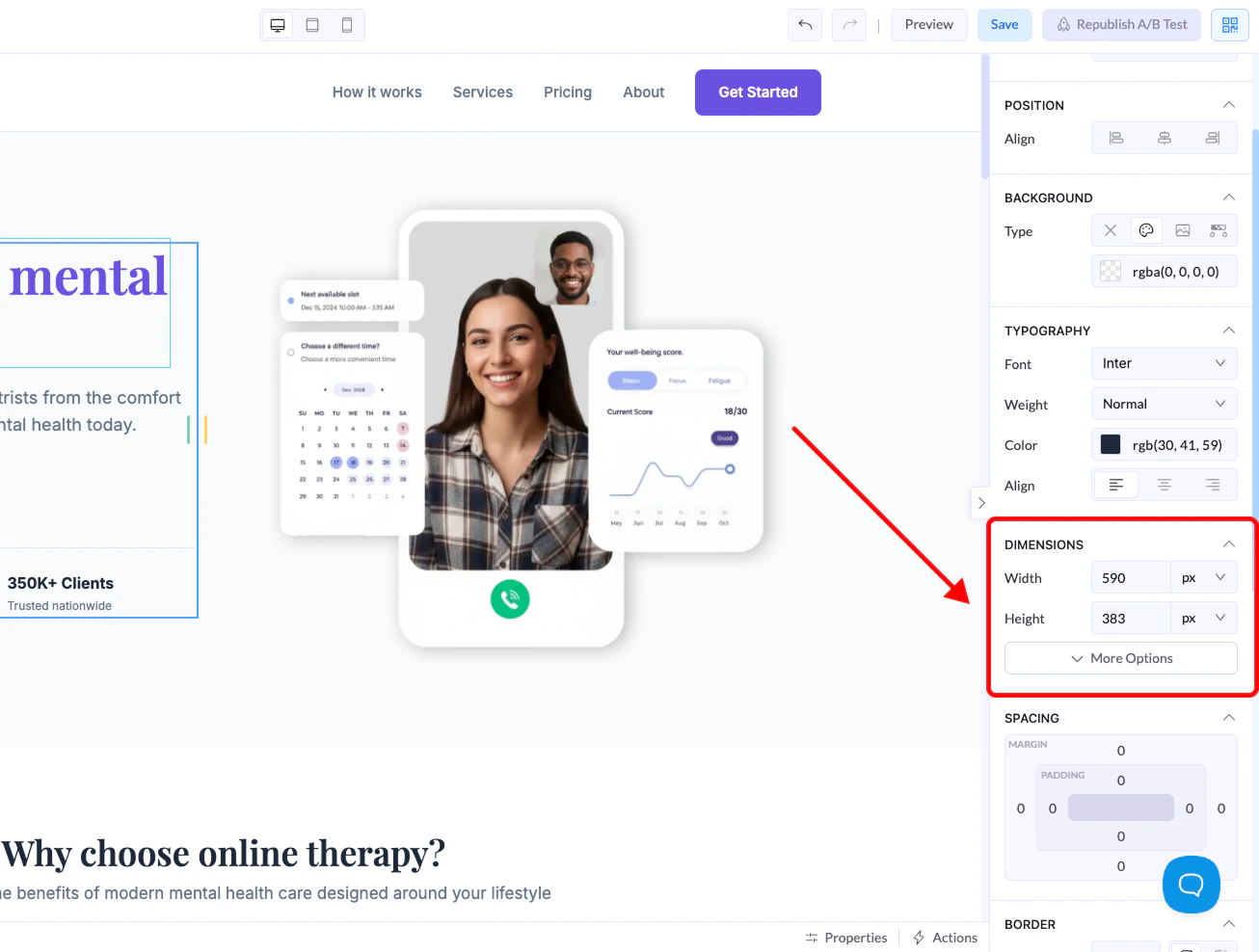
The Dimensions section lets you control the **size of any element on your canvas**. This helps you manage layout, spacing, and responsiveness.
You can find these settings in the **right-side panel** when selecting any element.
***
## Where to Find It
1. Click on any element in the canvas
2. Go to the **right panel**
3. Open the **Dimensions** section
 ***
## Size Controls
### Width
Controls how wide the element is.
### Height
Controls how tall the element is.
***
## Units Explained
When setting width or height, you can choose between different units:
***
## Size Controls
### Width
Controls how wide the element is.
### Height
Controls how tall the element is.
***
## Units Explained
When setting width or height, you can choose between different units:
 ### px (Pixels)
* Fixed size
* Does not change based on screen
* Best for precise control
### % (Percentage)
* Relative to the parent container
* Responsive and flexible
* Best for layouts that adapt to screen size
### Fit
* Automatically adjusts to content
* Element grows or shrinks based on what’s inside
***
## Advanced Options
Click **More Options** to access:
### px (Pixels)
* Fixed size
* Does not change based on screen
* Best for precise control
### % (Percentage)
* Relative to the parent container
* Responsive and flexible
* Best for layouts that adapt to screen size
### Fit
* Automatically adjusts to content
* Element grows or shrinks based on what’s inside
***
## Advanced Options
Click **More Options** to access:
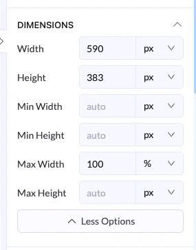 ### Min Width / Min Height
* Sets the smallest size the element can be
### Max Width / Max Height
* Sets the largest size the element can grow to
***
## Example
* Width → `100%`
* Max Width → `600px`
👉 The element will stretch on smaller screens but stay within 600px on larger screens.
***
## Best Practices
* Use **%** for responsive layouts
* Use **px** for exact control
* Use **Fit** when content size should define the element
* Set **max width** to keep layouts clean on large screens
### Min Width / Min Height
* Sets the smallest size the element can be
### Max Width / Max Height
* Sets the largest size the element can grow to
***
## Example
* Width → `100%`
* Max Width → `600px`
👉 The element will stretch on smaller screens but stay within 600px on larger screens.
***
## Best Practices
* Use **%** for responsive layouts
* Use **px** for exact control
* Use **Fit** when content size should define the element
* Set **max width** to keep layouts clean on large screens